By Owen Swanson & Charlie Goodwin
Welcome to Five-Hole Features, our new series of blogs dedicated to interesting aspects of the NHL that don't necessarily have to do with on-ice performance. This week we're taking a look at the alternate jerseys Adidas has announced for their second season as the NHL's official jersey provider. Not every team will wear a 3rd sweater this season, but here we do a quick breakdown of our thoughts on what has been announced, released, or leaked so far.
Anaheim Ducks
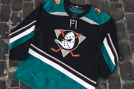
Charlie: I think Anaheim messed this one up a bit. Everyone loves the original jerseys. Bring those back, there’s no reason to change them. It’s still a cool jersey but it could’ve been a lot better.
Owen: While they definitely could have done a better job matching the originals, this isn’t a bad homage. These jerseys are definitely interesting and will be fun to watch on the ice, regardless of their accuracy.
Owen: While they definitely could have done a better job matching the originals, this isn’t a bad homage. These jerseys are definitely interesting and will be fun to watch on the ice, regardless of their accuracy.
Arizona Coyotes
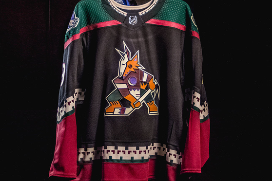
Owen: If you don’t like these jerseys, you’re either blind or just generally boring. An excellent allusion to the original Coyotes “Peyote Coyote” jerseys, the addition of more black and red make these fit better with the current uniform set and will give people a reason to turn on the dreadful Coyotes this season.
Charlie: Well I guess I’m boring because I’m not a huge fan of these jerseys. While I think the color scheme is really great and a nice shift from Arizona’s normal colors, the logo and tribal pattern are a bit out there for me, and would be best kept in the past.
Charlie: Well I guess I’m boring because I’m not a huge fan of these jerseys. While I think the color scheme is really great and a nice shift from Arizona’s normal colors, the logo and tribal pattern are a bit out there for me, and would be best kept in the past.
Boston Bruins (Winter Classic Jerseys)
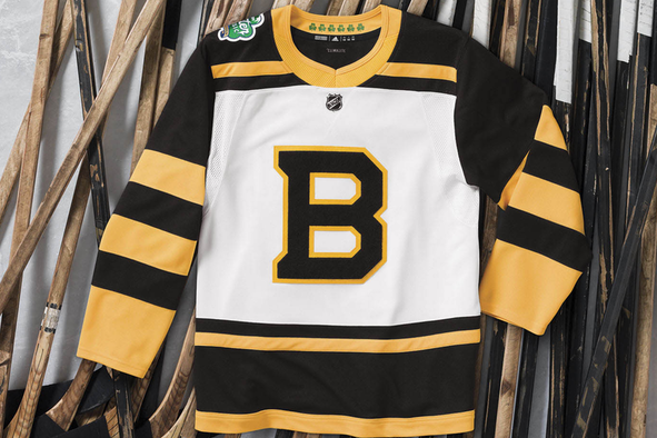
Owen: Boston kept it really simple with these sweaters. They even got rid of their normal “wheel and spoke” design. The design is too simple for me, especially in the torso area. Not a fan. The only recognizable aspects of Boston’s normal sweaters here are the colors and the letter “B”.
Charlie: I like the change of color for a more classic look, appropriate for the Winter Classic. I agree that they should have kept their iconic logo, and I’m never a fan of stripes. It’s an average jersey.
Charlie: I like the change of color for a more classic look, appropriate for the Winter Classic. I agree that they should have kept their iconic logo, and I’m never a fan of stripes. It’s an average jersey.
Calgary Flames
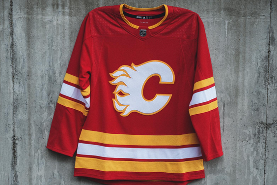
Charlie: I think Calgary did a great job on these jerseys. A classic and clean look that will complement a fun team on the ice with a fun jersey to look at. One of the best alternate jerseys this year.
Owen: I like the reference to their older style of jersey, although I think they could’ve made it more interesting and given it a more modern look. I know the old jerseys didn’t have any black, but some black in this iteration would’ve made the jersey a lot more interesting.
Owen: I like the reference to their older style of jersey, although I think they could’ve made it more interesting and given it a more modern look. I know the old jerseys didn’t have any black, but some black in this iteration would’ve made the jersey a lot more interesting.
Carolina Hurricanes (3rd Jersey and Hartford throwbacks)
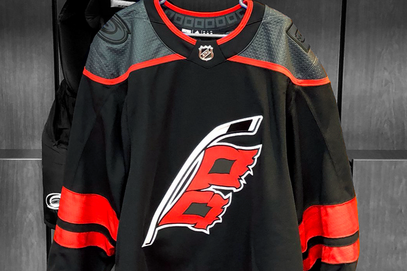
Owen: This is an excellent revival of an old Carolina alternate jersey. It’s really appropriate with their name (the flag is a hurricane warning sign). It’s an excellent usage of a hockey stick in a logo, and it doesn’t feel forced. The addition of a second flag on the stick is more accurate to actual hurricane warning signs, too, and a nice touch.
Charlie: I agree with everything you said, they eventually needed to correct the usage of the flag on the jersey (one flag means a rainstorm, not a hurricane). I don’t know why some are so low on these jerseys, in my opinion they are one of the better third jerseys released this season.
Charlie: I agree with everything you said, they eventually needed to correct the usage of the flag on the jersey (one flag means a rainstorm, not a hurricane). I don’t know why some are so low on these jerseys, in my opinion they are one of the better third jerseys released this season.
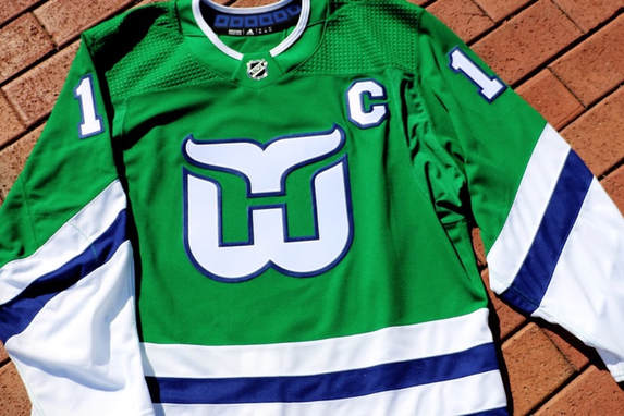
Charlie: Amazing tribute to the original iteration of the franchise, the Hartford Whalers. I’m glad they brought back the original jersey and didn’t make any modern changes to it. In my opinion, this is the best alternate jersey this season, and the only problem is they’re only wearing it three times.
Owen: It feels a little weird to be wearing a jersey of a team that was taken away from a city, especially since Carolina has the possibility of being relocated due to their lack of success in recent years, both on the ice and off. It looks great, but feels a little poorly timed.
Owen: It feels a little weird to be wearing a jersey of a team that was taken away from a city, especially since Carolina has the possibility of being relocated due to their lack of success in recent years, both on the ice and off. It looks great, but feels a little poorly timed.
Chicago Blackhawks (Winter Classic)
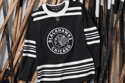
Owen: This feels like a really bad attempt at minimalism or subtlety. The straight black and white is extremely uninspired and the striping is just horrific. I get the sense that these were designed with far too big of a focus on being unique and I don't see the point. Just all around boring.
Charlie: I totally agree, for a team that usually has incredible jerseys, Chicago really dropped the ball on this one. There hasn’t been a Blackhawks jersey I really disliked until now. A team with a reputation like Chicago’s needs to do better, especially for a winter classic.
Charlie: I totally agree, for a team that usually has incredible jerseys, Chicago really dropped the ball on this one. There hasn’t been a Blackhawks jersey I really disliked until now. A team with a reputation like Chicago’s needs to do better, especially for a winter classic.
Colorado Avalanche
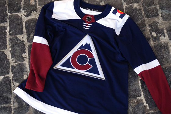
Charlie: While I think the colors of this jersey and its logo are nice, I really dislike the flag on the shoulder. If you want to bring back the old jerseys this alternate is referencing, then bring them back fully instead of including just a small reminder of the colors everyone wants back. Not to mention the asymmetry of the shoulder pads that results from this choice.
Owen: I agree the jersey logo is a nice reference to the old Colorado Rockies jerseys, and I like how they modified the old logo a little bit. I disagree about the colors, though. It's cool that they put the modern franchise’s spin on the old team’s logo. I agree the asymmetry on the shoulders is annoying, but I like the flags, and just prefer that they would’ve put one on each shoulder.
Owen: I agree the jersey logo is a nice reference to the old Colorado Rockies jerseys, and I like how they modified the old logo a little bit. I disagree about the colors, though. It's cool that they put the modern franchise’s spin on the old team’s logo. I agree the asymmetry on the shoulders is annoying, but I like the flags, and just prefer that they would’ve put one on each shoulder.
Columbus Blue Jackets
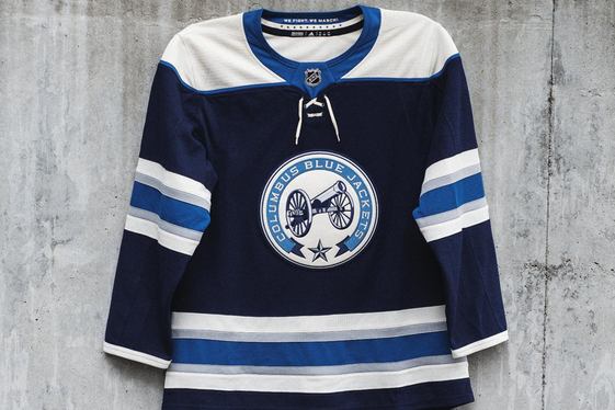
Owen: I’m pretty sure this is just a revival of a previous alternate jersey. The color scheme is a little bit bland, as it was before. Some red somewhere in there would be nice, but the logo is unique and striking, and a nice reference to Ohio’s Civil War history as well. Not bad by any stretch.
Charlie: While I agree with you on the color scheme, I think it fits well with the old-time feel of the cannon logo. I’ve never been a fan of circular patches on the chest of jerseys, so I think the Blue Jackets would have been better off just putting the cannon without the circular patch surrounding it. Average jersey.
Charlie: While I agree with you on the color scheme, I think it fits well with the old-time feel of the cannon logo. I’ve never been a fan of circular patches on the chest of jerseys, so I think the Blue Jackets would have been better off just putting the cannon without the circular patch surrounding it. Average jersey.
Edmonton Oilers
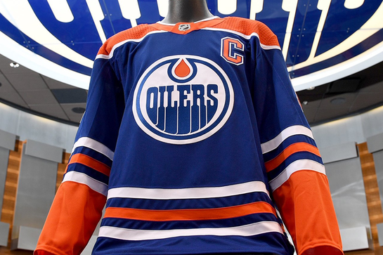
Owen: These look exactly like the old Oiler home jerseys before they switched to orange as their main color. I don't know why they would bring back an old home jersey as their alternate. It's a very boring move and feels like a cop out. Something plain based on the oil drop logo or generally more bright in color would’ve been better.
Charlie: I think these are really nice and a classic Oiler look. I agree that they shouldn’t be used as an alternate, but I think they should be the normal home jersey. I have no idea why they use orange as the normal home jersey when the blue are preferred by the fans. Same problem as the Whalers jersey -- they aren’t worn enough.
Charlie: I think these are really nice and a classic Oiler look. I agree that they shouldn’t be used as an alternate, but I think they should be the normal home jersey. I have no idea why they use orange as the normal home jersey when the blue are preferred by the fans. Same problem as the Whalers jersey -- they aren’t worn enough.
New Jersey Devils
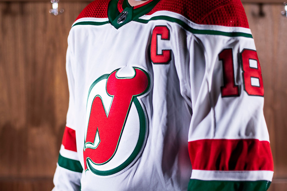
Charlie: I think this is a really great jersey. It’s a good attempt to stay simple, as the only change is using green as the trim, as opposed to the black they use currently. The goal of paying tribute to the old jerseys is achieved, while not appearing lazy, like Chicago’s alternate.
Owen: I agree this is a nice take on the old Devils jersey. It's another case of teams referencing their franchise history in an interesting way, and I'm a big fan.
Owen: I agree this is a nice take on the old Devils jersey. It's another case of teams referencing their franchise history in an interesting way, and I'm a big fan.
New York Islanders
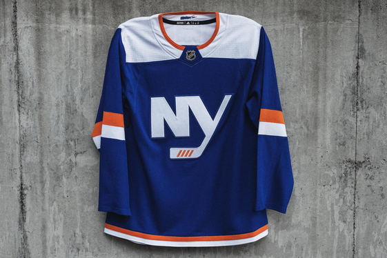
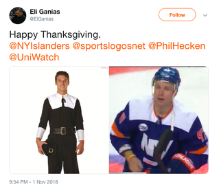
Owen: These jerseys are way too plain, and the fact that there is so little going on besides the “NY” logo makes it look like a practice jersey. The big white rectangle on the shoulders reminds me of what the pilgrims wore at the first Thanksgiving. Not a great look.
Charlie: The shoulder pads are horrendous and I agree about it being similar to a practice jersey. It was a good decision to incorporate the teams orange and blue color scheme into the old black-and-white third jerseys with the “NY” logo. Maybe the Isles’ hot start can make these jerseys a little more bearable to watch on the ice.
Charlie: The shoulder pads are horrendous and I agree about it being similar to a practice jersey. It was a good decision to incorporate the teams orange and blue color scheme into the old black-and-white third jerseys with the “NY” logo. Maybe the Isles’ hot start can make these jerseys a little more bearable to watch on the ice.
Philadelphia Flyers
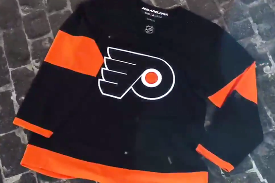
Charlie: While the black is definitely a cool aspect of the design, the jersey feels a bit too much like a “Halloween” edition. It’s not a jersey that I think can be worn many times throughout the year, as it looks like it belongs in October. I think more variation should have been used in the colors and patterns on the jersey.
Owen: I like the use of black as the main color in this alternate, but the way they use orange to accent it is too simple. There should be a more interesting trim on the elbows and the bottom part of the torso. It would’ve also been nice if they modified the original Flyers logo in some way.
Owen: I like the use of black as the main color in this alternate, but the way they use orange to accent it is too simple. There should be a more interesting trim on the elbows and the bottom part of the torso. It would’ve also been nice if they modified the original Flyers logo in some way.
Pittsburgh Penguins
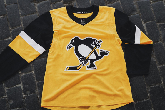
Owen: The use of gold as the primary color is awesome and makes it pop, but once again I get a practice jersey feel. The front is so plain and bare with only the Penguins logo on it. Overall, not an awful jersey because of its use of vibrant color, just could have been a lot better. Not one of my favorites.
Charlie: Three words: Too. Much. Yellow. This jersey is not pleasing to the eye whatsoever, and with so many classic jerseys the Penguins could have brought back, it’s a shame they went in this direction. I also don’t like the elimination of the triangle surrounding the penguin logo. Easily my least favorite alternate jersey this season.
Charlie: Three words: Too. Much. Yellow. This jersey is not pleasing to the eye whatsoever, and with so many classic jerseys the Penguins could have brought back, it’s a shame they went in this direction. I also don’t like the elimination of the triangle surrounding the penguin logo. Easily my least favorite alternate jersey this season.
San Jose Sharks
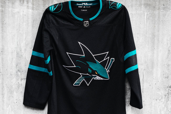
Charlie: I really like black as the primary color for this jersey. It’s an intimidating look for an intimidating team. Similar to the Flyers’ jersey I think there could have been more variation with the trim and possibly a third color. A really small detail I like is the text on the inside of the neckline that reads “This is Sharks territory”. Overall great jersey.
Owen: This jersey really bores because of how much black it has, and the shade of teal they used for the elbow trim and shoulder patches looks really bad with just straight black. SOme more white in this jersey would have definitely made this look better. Its overall plainness on the front is its biggest problem. These are tied with the Blackhawks' Winter Classic jerseys as my least favorite alternate sweater being worn by NHL teams this season.
Owen: This jersey really bores because of how much black it has, and the shade of teal they used for the elbow trim and shoulder patches looks really bad with just straight black. SOme more white in this jersey would have definitely made this look better. Its overall plainness on the front is its biggest problem. These are tied with the Blackhawks' Winter Classic jerseys as my least favorite alternate sweater being worn by NHL teams this season.
St. Louis Blues
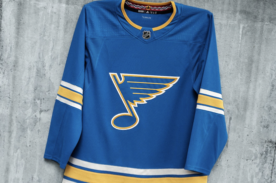
Owen: This a really nice revival of the original Blues jerseys. This shade of blue is really nice and I wish it was a bigger part of the current Blues jersey set. The yellow could pop more (they should've chosen a brighter shade of yellow), and some yellow near the shoulder pads would’ve broken up the plainness of the front. One of the better alternate jerseys that will be worn this season.
Charlie: Similar to Calgary, this is a really clean and classic jersey. I agree that it’s a perfect tribute to the original Blues jerseys. The shade of blue will look really nice on the ice, and makes it one of the best alternate jerseys this season.
Charlie: Similar to Calgary, this is a really clean and classic jersey. I agree that it’s a perfect tribute to the original Blues jerseys. The shade of blue will look really nice on the ice, and makes it one of the best alternate jerseys this season.
Washington Capitals
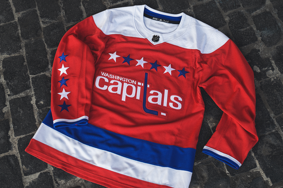
Charlie: This is a great jersey overall. They’ve had them recently, but couldn’t wear them last year since it was Adidas’ first year as the NHL’s jersey provider. It was a great decision to bring them back because they're pretty much universally liked. One of the best alternates this year.
Owen: I really like this alternate. It’s very similar to the ones they had before the Adidas contract. It would’ve been cool to see the Caps do something newer, possibly honoring their Stanley Cup win in some way. However, they’re still really aesthetically pleasing and will be nice to watch on the ice, despite Adidas’ decision to not be innovative.
Owen: I really like this alternate. It’s very similar to the ones they had before the Adidas contract. It would’ve been cool to see the Caps do something newer, possibly honoring their Stanley Cup win in some way. However, they’re still really aesthetically pleasing and will be nice to watch on the ice, despite Adidas’ decision to not be innovative.
Winnipeg Jets
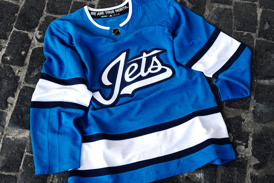
Owen: These are some of the worst alternates released this year. They look quite bland, and don’t incorporate any red, which looks nice as the brightest color in the Jets' color scheme. Overall these are really plain, and it reminds me of a jersey a fraternity would give out.
Charlie: While I think the shade of blue they used in the jersey is really nice, I agree that the design is boring. It’s just too simple for me. You're right that it would look more appropriate saying “Thetas” instead of “Jets”.
Charlie: While I think the shade of blue they used in the jersey is really nice, I agree that the design is boring. It’s just too simple for me. You're right that it would look more appropriate saying “Thetas” instead of “Jets”.
Photo Credit: https://www.icethetics.co/jerseywatch/
 RSS Feed
